Saturday, June 20, 2009

WOLFGANG WEAINGART


WOLFGANG WEINGART

 Weingart: ‘what still surprises and inspires me today: to turn blank paper into a printed page.’ Nothing can be more reassuring than to read words like these from someone who has almost forty years of experience behind him. What more can you ask for in a career?


Weingart was born in the midst of the World War II in Germany. Most famous for his experimental, expressive work that broke the mould of classical Swiss typography, Weingart began his typographic career in the early sixties as an apprentice of hand composition at a typesetting firm. He then decided to further his studies at the Basel School of Design in Switzerland, the cradle of classical Swiss typography. Following his rather unsuccessful attempt at completing his course, Armin Hoffmann, who was then the head of the Basel School, invited him to teach there, by the sheer admiration of his work. He has been teaching there ever since and had made extraordinary impact on the contemporary typographic landscape.


Swiss typography was founded upon the teachings of the Bauhaus in Germany soon after World War II and became a rational approach to typography. The use of grid systems was the key to the logical disposition of type and images on the page, along with sanserif typefaces for clear, functional communication. It was believed that typography should be unobtrusive and transparent, in order to clearly communicate its textual content. By the beginning of the sixties, the language of Swiss typography had already gained reputation the world over. Swiss typography became synonymous with corporate design for multinationals, and subsequently referred to as the ‘international typographic style’.


and then came.....Wolfgang Weingart- it can be said that he started it all, he ignited the spark of ‘typographic anarchy’ that exploded on the verge of the nineteen nineties, he began what was subsequently dubbed ‘Swiss Punk’, ‘New Wave’ ,perhaps even post-modernism. 


‘not only one conception of typography exists in Switzerland.’ His experimental typography was also Swiss, because it was a ‘natural progression’ from the classical Swiss typography as we know it. His typographic experiments were strongly grounded, and were based on an intimate understanding of the semantic, syntactic and pragmatic functions of typography. Whereas ‘traditional’ Swiss typography mainly focused on the syntactic function, Weingart was interested in how far the graphic qualities of typography can be pushed and still retain its meaning. This is when the semantic function of typography comes in: Weingart believes that certain graphic modifications of type can in fact intensify meaning. ‘What’s the use of being legible, when nothing inspires you to take notice of it?’


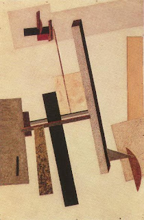
Weingart’s work is characterized by his painterly application of graphical and typographical elements. The emotionally-charged lines, the potent, image-like qualities of his type, the almost cinematic impact of his layouts, all speak of his great passion of creating with graphical forms. His typographic layouts are compelling yet lucid, free yet controlled. Some of his personal work is almost akin to landscape paintings, only that his paintbrush is replaced by type, rules and screens. He does not create a divide between fine art and typography. His inspirations were mainly drawn from the processes of typesetting and reproduction, where he finds great pleasure in discovering their characteristics and pushing them to their limits.


Weingart works with a very limited palette of typefaces. He suggests that four typefaces are enough to address all typographic problems. One of these typefaces would certainly be Akzidenz Grotesk, an early sanserif of the grotesque genre designed by the Berthold Foundry in Germany at the close of the 19th century. ‘I grew up with Akzidenz Grotesk and I love it. Akzidenz Grotesk has a certain ugliness to it, that’s why it has character.’  The simplicity of his choice of typefaces speaks of his fondness of simple tools.


‘For me, typography is a triangular relationship between design idea, typographic elements, and printing technique,’ writes Weingart. The possibilities that these technologies offer seem endless to him, and he finds it hugely satisfying to explore the materials: ‘The thing that is so special for me… is the variability of the materials under the influence of idea and technique.’

 It is the tension between his desire to express and his consideration for communication that creates this interesting mix of work and his perpetually inquisitive working ethos.‘That’s my schizophrenic personality’. 

Weingart’s typographic experimentations spanned across three different eras of typesetting technology: letterpress, phototypesetting and the computer. Yet, despite how readily he accepted and pushed the boundaries of the letterpress and phototypesetting processes, he is rather unenthusiastic about the computer technology. The computer, to him, is too illusive. He compares the computer to a digital watch: a traditional watch shows a ‘landscape’, it tells a story; a digital watch only shows a particular moment. Graphic design is in a big crisis. The education in our school is not the best any more. The value of living has changed. The computer and electronic tools in general are destroying our natural needs.’ The natural needs, perhaps, is our need to create, to express.


EL LISSITSKY

EL LISSITSKY


El Lissitzky was born in 1890.

Russian painter, typographer, and designer, a pioneer of nonrepresentational art in the early 20th century. His innovations in typography, advertising, and exhibition design were particularly influential.


Lissitzky studied architecture at Darmstadt, Ger., and, during WW1, at Moscow. In 1919 Marc Chagall appointed him teacher at the revolutionary school of art in Vitebsk. Kasimir Malevich, the painter and founder of the Suprematist movement, which advocated the supremacy of pure geometric form over representation, also taught there, and he greatly influenced Lissitzky. In 1919 Lissitzky began to work on a series of abstract geometric paintings that he named “Proun,” an acronym for the Russian words translated as “Projects for the Affirmation of the New.” These paintings were a major contribution to the Constructivist art movement. In 1921 he became professor at the state art school in Moscow. He founded the international journal 'Vesc' in 1922 and devoted himself increasingly to typography and exhibition design. In Germany, he met the artist-designer Lászlo Moholy-Nagy, who transmitted Lissitzky’s ideas on art to western Europe and the United States through his teaching at the Bauhaus.


In 1925 Lissitzky returned to Moscow and taught at the post-Revolutionary art school Vkhutemas. Between 1926 and 1934 Lissitzky designed several exhibitions. Lissitzky worked on the journal 'The USSR in Architecture', for which Lissitzky and his wife, Sophie Lissitzky-Küppers, designed a great many issues. Lissitzky was a Russian avant-garde artist who did not limit himself to developing a form of abstract painting but rather extended the new functionalism to photography, book design, architecture and urban planning. His enormous versatility enabled El Lissitzky to forge links between the Russian Constructivists and Neo-Plasticism (De Stijl), the Bauhaus and Dada.


His experiments in spatial construction led him to devise new techniques in exhibiting, printing, photomontage, and architecture, which have had much influence in western Europe.

El Lissitzky died in Moscow in 1941.


Friday, June 19, 2009

GUSTAV KLIMT

GUSTAV KLIMT


Gustav Klimt was born on July 14, 1862, Austria, the second seven children,  the son of a poor jewelry engraver. At the age of fourteen Gustav began studying at the University of Plastic Arts in Vienna,  he studied at the University until graduating at the age of twenty, at which time he had been commissioned to create several decorative works, making use of his training in modernist craftsmanship.   He then founded the Känstlercompanie (Company of Artists) studio with his brother Ernst, and Franz Matsch, a fellow student.  The three found much success as mural painters, getting contracts from museums, theaters, and other decorative artwork for wealthy patrons.  The company eventually ceased to exist, following the death of Ernst, and a falling out with Franz Matsch.


Klimt's paintings often included gold and silver paint, metal, and ceramics, and as much attention was given to ornamental details as to their subjects. Very few of Klimt's paintings were done on canvases, as he preferred to paint murals.  Klimt also found inspiration in Byzantine mosaics, which he discovered while exploring Vienna.


In 1897,  Gustav Klimt took an interest in politics and rallied other artists to found the Vienna Sezession, a Art Nouveau movement whose goal was to give young, innovative artists a chance to get exposure, and to revolt against the conservative attitudes of the academic art world.  He organized several exhibits, attracting thousands from around the world to view their revolutionary art, and even published "Ver Sacrum", a monthly magazine about the movement and its artists.  His own personal style came to represent the movement's aesthetics.


In 1905, following a series of disagreements with other embers of the Sezession several others leave the group, and form a new association called the Kunstschau (Art Show).  Klimt was a very popular artist, but he was also quite controversial.  He was renowned for his womanizing, and often used prostitutes as models.  Many of his works were considered too sensual for the mores of early 20th Century Vienna, and even his more historical, or mythical works featuring nudes were often criticized for being too erotic.   Fortunately, the scandals only served to heighten Klimt's international recognition, if not his notoriety.


In addition to women, Klimt often traveled to the outskirts of Vienna,  and the Italian countryside, finding inspiration in nature, particularly autumnal landscapes, which already showed the rich golden hues of his own decorative designs.  From the opulence of the Viennese Bourgeoisie to the mythological, from eroticism to the simple beauty of nature, Klimt's artwork always maintained its highly stylized feel, but what remains one of its most fascinating traits is that while concentrating on the superficial, its depth cannot be ignored. 


In 1917, he was made an honorary member the Viennese Academy of Fine Arts.   On January 11th of the following year, at the age of 55, Gustav Klimt suffered a stroke while working in his apartment.  Weakened from the stroke, and suffering from pneumonia, he died less than a month later, on February 6th, 1918.


Katie...

1990 - 1999
1.
Designer- Rob Janoff 1998


2. Paul Rand 1990

3.
4.

Nike - Carolyn Davidson 1995


5.
Paul Rand logo's

6.

7.
'Palawa Fonts' 1998


8. Mark Dagley


9.

David Carson - Raygun (Music magazine)

10.
Colors magazine - 'Benetton' 1991

11.
Adobe Pahotoshop 1.0 'Thomas and John knoll' 1990-95

12.
Bambang Widodo Typography 'Domino Type' 1998

13.
'Kero' 1999


14.
'Marvel' 1990's