Friday, March 27, 2009


Regarded as this country's most prominent Pop artist, Martin Sharp has made significant contributions to Australian culture since the early 6Os, with his posters and record covers in particular receiving international recognition. Martin contributed to Australian "Oz" magazine in 1963, published by Richard Neville and Richard Walsh, beginning Martins fame. Richard Neville established the London "Oz', which was just as controversial as its Australian ancestor, Martin became its Art Director and witty cartoonist.

Pop culture in England at the time attracted and activated Martin’s already highly alive imagination. “Oz” magazine was achieving for him in England what it had done in Australia. He was becoming known. When he was introduced to a musician in a night club one evening Martin wrote some lyrics on a serviette and gave it to him in the hope it would lead to something. The musician was the famous rock guitarist Eric Clapton, and the song "Tales of Brave Ulysses” was recorded on the Cream’s next record album “Disraeli Gears" for which Martin subsequently also designed the cover. The next cover design for the Cream was ''Wheels of Fire'. Martin was awarded a New York Art Directors Prize for Best Album Design for 1969.


Martin had found in England the Pop culture he knew existed there. He became a recognised Pop artist and designed posters of Bob Dylan, Jimmy Hendrix and Donovan. He also found Tiny Tim, an artist whose influence and inspiration has remained with him to this day. Martin's second and most important art education was living in Chelsea in the late sixties. Eric Clapton, and the Australian film maker and artist Phillipe Mora, were sharing Martin's studio. Martin continued his interest with the idea of Appropriation creating “Art Book", another gem-like production approximately 5" x 6" in size and incorporating 36 colour collages cut from the pages of glossy art books, bringing together the work in single images of Magritte and Van Gogh, Matisse and Magritte, Botticelli and Picasso with occasional overlays of Van Gogh on Van Gogh. Van Gogh on Botticelli or Vermeer on Vermeer. Explained Martin, “I have never been shy about cutting things up if I had a good idea. To me it was worth the price of a book for the idea it expressed, the interconnecting of different worlds. "I could put a Gaugan figure in a Van Gogh landscape, make the composition work, and also say something about their relationship."


During the seventies, Martin engaged with the Nimrod Theatre and produced the Nimrod posters. This important set of posters, now a collectors' item like so many of his limited editions, included his poster for the play "Young Mo”. The Australian comic "Mo” became the symbol of the Nimrod Theatre and one of Martin's most well known images.


www.wikipedia.org/wiki/Martin_Sharp


www.collectable-records.ru/images/post/british_scene/martin_sharp/index.


www.greenplanet.com.au/gallery/msharp/workin.


www.milesago.com/People/martin-sharp


www.martinsharp.com


First poster designer-Victor Moscoso


Intense, contrasting, vibrating, colours, artistic, spontaneous, freedom, unrestrained,
almost illegible, candid, and passionate.


These are just some of the words that spring to mind when I hear the name Victor Moscoso and think of his posters.
His contributions to poster design have made him famous for his psychedelic style and catchy use of colour and type. Moscoso studied under Joseph Albers at Yale University, gave him credit for all his teachings, and turned his careful colour theories upside down to make them work for him.


In 1967 he began his journey with posters for ‘the Family Dog dances’ at the Avalon Ballroom as well as his ‘Neon Rose’ posters for the Matrix.
Living in San Francisco’s countercultural environment during the ‘60’s was a large influence in his work, during this time Moscoso created some of his strongest symbolic images.


After that era he devoted himself to the comic strips and editing issues of ‘Zap Comix’ for the 'Underground Comix' company, he has also designed many fabulous t-shirts and Billboards. Moscoso has won two awards for his animated advertising projects and has worked recently in music videos.


If you enjoy Moscoso's style of posters you might be interested in viewing the shorts to this movie : www.AmericanArtifactMovie.com

www.wolfgangsvault.com/ga/victor-moscoso/9597.html

www.victormoscoso.com/

www.collectable-records.ru/images/post/moscoso/index.html

.en.wikipedia.org/wiki/Victor-Moscoso

www.denverartmuseum.org/files/File/psych%20posters%20key%20artists.pdf

Perverse Optimist

" To me, nothing is more v i b r a n t than having the power to do something but not having the e x p e r i e n c e of knowing what's right and what's wrong." TIBOR KALMAN


Kalman was best known for the groundbreaking work he created with his New York design firm, M&Co, and his brief yet influential editorship of Colors magazine. Throughout his 30-year career, Kalman brought his restless intellectual curiosity and subversive wit to everything he worked on -- from album covers for the Talking Heads to the redevelopment of Times Square. Kalman incorporated visual elements other designers had never associated with successful design, and used his work to promote his radical politics. The influence of his experiments in typography and images can be seen everywhere, from music videos to the design of magazines such as Wired and Ray Gun.
Kalman was born in Budapest, Hungary in 1949 and emigrated to US with his family in 1956.From 1968 he worked for the one-store company that eventually became the Barnes & Noble bookshop empire, creating window displays, store designs, signs and advertisements. Tibor Kalman founded the legendary, multidisciplinary design firm M&Co in 1979. In collaboration with his wife Maira, the conceptually progressive firm initially worked on whatever commercial projects it could get before moving towards the cultural sector and the creation of content and form in all areas of graphic design, as well as industrial design, film titles, television spots, children's books and architecture. The Kalman's social concerns and reactions to contemporary attitudes resulted in products that are enjoyed internationally as they address contemporary issues, including time (5 o'clock really is the most important time for many of us) and garbage (crumpled paper can have a real nice look). Kalman was art director of Artforum from 1987-88 and creative director of Interview from 1989-91. In autumn 1990 he was recruited as editor-in-chief of a controversial new Benetton magazine, Colors. He produced five issues in new York before closing M&Co in 1993 and moving to Rome, where he edited eight more issues. In September 1995 Kalman quit Colors and returned to New York to consider new directions.
Tibor saw himself as a social activist for whom graphic design was a means of achieving two ends: good design and social responsibility. Good design, which he defined as “unexpected and untried,” added more interest, and was thus a benefit, to everyday life. Second, since graphic design is mass communication, Tibor believed it should be used to increase public awareness of a variety of social issues.He urged clients like Restaurant FIorent to use the advertising M&Co created for them to promote political or social messages. He devoted M&Co’s seasonal self-promotional gifts to advocate support for the homeless.
In the last years of his life, despite his illness, Kalman enjoyed a remarkable period of productivity. In addition to doing smaller projects with M&Co, he oversaw the creation of two books: "Chairman Rolf," a tribute book for furniture designer Rolf Fehlbaum (1997, Princeton Architectural Press), and his own retrospective, the Hall and Bierut book "Perverse Optimist."
Today, the influence of M&Co is still strong, both as a result of its work and that of the many designers, like Stefan Sagmeister, Stephen Doyle, Alexander Isley, Scott Stowell, and Emily Oberman, who worked there and went on to start their own design studios, also in New York City. Tibor Kalman was a member o Alliance of Graphique Internationale (AGI). Until his death (1999 - Puerto Rico), Kalman was married to the illustrator and author Maira Kalman.

<< Of the two names that changed design in the ’80s and ’90s — Mac and Tibor — one changed the way we work, the other the way we think. The former is a tool, the latter was our conscience.
>>

http://en.wikipedia.org/wiki/Tibor_Kalman
http://www.aiga.org/content.cfm/medalist-tiborkalman
http://www.eyemagazine.com/feature.php?id=30&fid=167
http://www.salon.com/people/obit/1999/05/19/kalman/
http://www.typotheque.com/articles/tibor_kalman.html

Tuesday, March 24, 2009


Victor Moscoso (born 1936) is an American illustrator and comic book artist, especially noted for his work in the late 1960s as a designer of psychedelic art and concert posters (many for The Fillmore) and as a contributor to underground comix (he is among the artists who regularly appear in Zap Comix).

Psychedelic art is art inspired by the psychedelic experience induced by drugs such as LSD, mescaline, and psilocybin. The word "psychedelic" (coined by British psychologist Humphrey Osmond) means "mind manifesting". By that definition all artistic efforts to depict the inner world of the psyche may be considered "psychedelic". However, in common parlance "Psychedelic Art" refers above all to the art movement of the 1960s counterculture. Psychedelic visual arts were a counterpart to psychedelic rock music. Concert posters, album covers, lightshows, murals, comic books, underground newspapers and more reflected not only the kaleidoscopically swirling patterns of LSD hallucinations, but also revolutionary political, social and spiritual sentiments inspired by insights derived from these psychedelic states of consciousness.

My favorite poster that he did was the one of the peacock in purple, turquoise blue and lime green. I like this due to the colour and the peacock design as well. Below are my five images I like the best of his and I find he colours appealing to me.

http://www.google.com.au/search?hl=en&q=Victor+Moscoso&btnG=Google+Search&meta=
http://www.victormoscoso.com/directory.html
http://www.victormoscoso.com/
http://www.victormoscoso.com/directory.html
http://en.wikipedia.org/wiki/Victor_Moscoso
http://en.wikipedia.org/wiki/Zap_Comix
http://www.collectable-records.ru/images/post/moscoso/index.htm

Martin (THE MAN) Sharp


Martin Sharp
(born 1944)

Regarded as this country's most prominent Pop artist, Martin Sharp has made significant contributions to Australian culture since the early 6Os, with his posters and record covers in particular receiving international recognition.
Sharp an artist, underground cartoonist, songwriter and film-maker.His famous psychedelic posters of Bob Dylan, Donovan and others rank as classics of the genre, alongside the work of Rick Griffin, Hapshash and the Coloured Coat and Milton Glaser. His covers, cartoons and illustrations were a central feature of Oz magazine, both in Australia and in London. Sharp was educated at Cranbrook private school, where one of his teachers was the noted artist Justin O'Brien. In 1960 Martin enrolled at the National Art School at East Sydney, where began his artistic career, contributing to the shortlived student magazine The Arty Wild Oat, along with fellow artists Garry Shead and John Firth Smith. He also began submitting cartoons to The Bulletin. In 1961 he enrolled for two terms in Architecture at Sydney University before returning to the NAS.
He also co-wrote one of Cream's most famous songs, "Tales of Brave Ulysses", and in the 1970s he became a champion of singer Tiny Tim, and of Sydney's embattled Luna Park.


MILTON GLASER

Milton Glaser – born26. 6. 1929 in New York, USA -

Leading American graphic designer, Illustrator, teacher, working with Seymour Chwast at Push Pin Studios in New York, president from its founding in 1954 until he left in 1970. He founded Milton Glaser Inc. in 1974, also in New York.

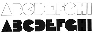
Fonts ; Babyfat, Babycurls, Baby teeth, Houdini, Glaser Stencil.

Baby Fat, designed by Milton Glaser in 1964, saw a lot of action during the psychedelic poster phase. This little dumpling is based on that workhorse, and takes its name from a phrase that also got around a lot in the 60s.

The PC PostScript, TrueType and OpenType versions contain the complete Latin language character set (Unicode 1252) plus support for Central European (Unicode 1250) languages as well.


The renowned American illustrator and graphic designer Milton Glaser designed Glaser Stencil in 1970. Glaser Stencil is a perfect summation of both Modernist proportion and New York-style solidity and self-assurance. An all capitals font, the shapes of the letters are reminiscent of popular sans serif faces of the time, such as Futura and ITC Avant Garde Gothic. Like everything New York-related, Glaser Stencil should be used big, in headlines and display applications, where it can play a bold, proud, and confident role.

http://new.myfonts.com/fonts/nicksfonts/keepon-truckin-nf/

//www.linotype.com/406/miltonglaser.html

http://www.identifont.com/show?7JT

http://designmuseumshop.com/catalogue/books-media/graphics-typography/milton-glaser

http://www.businessweek.com/innovate/content/jan2006/id20060103_370096.htm

Tim Biskup


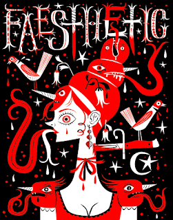
Tim Biskup is a Southern California fine artist whose work has been shown worldwide, including galleries and museums in Los Angeles, New York, San Francisco, Tokyo, Kyoto, Barcelona, Berlin, Sao Paulo, Buenos Aires and Melbourne.

Long recognized for his complex color and design theories and a decidedly populist aesthetic, Biskup has amassed a cadre of loyal fans and collectors. Recent years have seen the artist tend towards more complex, personal and conceptual work while maintaining a commitment to visual experimentation. His free spirited style recalls 1950s storybook illustration, with bright colors and whimsical shapes unrestricted by the black outlining typically used in character design. He works with playful and vibrant psychedelic imagery in the pop-design genre that emerged in the late 20th century through such diverse media as silk screening, text tile production, and roto cast vinyl. He is also a significant contributor to the GAMA-GO clothing line.

With a consistent output of original artwork, prints, sculptures, books and other editions Tim Biskup has produced a body of work that extends into the far reaches of the art and design worlds. In 2004 he opened Bispop Gallery, a small retail shop and exhibition space located in the Old Town section of Pasadena, California.

Links:
http://en.wikipedia.org/wiki/Tim_Biskup
www.timbiskup.com
www.images.google.com

JAMIE REID ::::::::::::: POSTER MASTER!!!


Sourced from.....

www.electriksheep.co.uk
www.urbanangel.com

"Turns out I like these boys who break all the RULES!!!!
Sheer coincidence I'm sure.
Anyway, here we go again..." elle

INTRODUCING.....

Jamie Reid, educated at John Ruskin Grammar School in Croydon, is a British artist and anarchist with connections to the Situationists. His work, featuring letters cut from newspaper headlines in the style of a ransom note came close to defining the image of punk rock, particularly in the UK.

His best known works include the Sex Pistols album Never Mind the Bollocks, Here's the Sex Pistols and the singles "Anarchy in the UK", "God Save The Queen", "Pretty Vacant" and "Holidays in the Sun".

Reid produced a series of screen prints in 1997, the twentieth anniversary of the birth of Punk rock. Reid has also produced artwork for the world music fusion band Afro Celt Sound System. Jamie Reid created the ransom-note look used with the Sex Pistols graphics while he was designing Suburban Press, a radical political magazine he ran for five years.


Since 2004, Reid has been exhibiting and publishing prints with the Aquarium Gallery.

In May 2007, a career retrospective for Reid, entitled "X Marks the Spot", was held in Shoreditch, London.


RULES, like buttons, are meant to be undone,
 and Jamie Reid is the original unfastener of all that's been held together and hallowed in Britain over the past thirty years. The image pirate, painter, and sloganeer remains the country's top anti-establishment Big Name Artist. Reid is infamous as the agitator who put the safety pin through the Queen's lip to visually define punk, and it's icons, the Sex Pistols. But for him it was no hip fashion statement or career move. It was a chance to get visual and philosophical ideas through to the mainstream. 
And that spirit's still firing, on all cylinders.
"All and all he seems like my kinda guy. Hope ya'll enjoyed! Thanks." elle